Contact Us : 800.874.5346 International: +1 352.375.0772


The PivotTable is a powerful tool of Excel that summarizes data in meaningful ways. It allows users to flexibly drag and drop the data they want to analyze, preview the presentation of the data, and make decisions. This blog provides an overview of PivotTables.
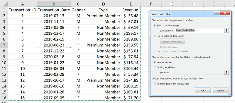
Assume a dataset as the following [you may paste it to Excel]:
| A | B | C | D | E | |
|---|---|---|---|---|---|
| 1 | Transaction_ID | Transaction_Date | Gender | Type | Revenue |
| 2 | 1 | 2019-07-13 | M | Premium Member | $36.48 |
| 3 | 2 | 2017-11-11 | M | Member | $67.01 |
| 4 | 3 | 2017-05-06 | F | NonMember | $69.14 |
| 5 | 4 | 2019-12-17 | M | NonMember | $196.17 |
| 6 | 5 | 2018-02-19 | F | NonMember | $189.06 |
| 7 | 6 | 2020-06-23 | F | Premium Member | $158.55 |
| 8 | 7 | 2017-12-22 | F | NonMember | $153.61 |
| 9 | 8 | 2020-05-18 | M | NonMember | $77.94 |
| 10 | 9 | 2019-01-22 | M | NonMember | $116.14 |
| 11 | 10 | 2019-06-04 | M | NonMember | $105.44 |
| 12 | 11 | 2020-02-29 | F | Member | $55.34 |
| 13 | 12 | 2018-10-17 | M | Premium Member | $174.89 |
| 14 | 13 | 2019-06-16 | M | NonMember | $108.19 |
| 15 | 14 | 2020-01-28 | M | Member | $103.81 |
| 16 | 15 | 2017-09-05 | F | Member | $71.70 |
To create an Excel table, follow the steps below:
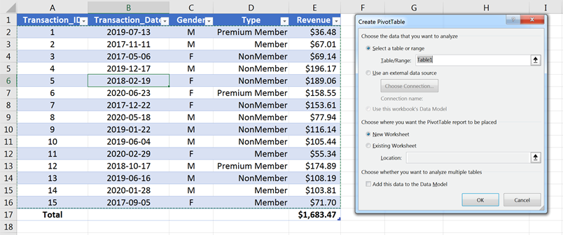
1. Make sure the dataset has headers for each column.
2. Select any datum (cell) in the dataset.
3. Convert the data range into an Excel Table. (Overview of Excel Tables)
Note: This step is optional but recommended.
4. On the ribbons, select Insert > PivotTable.
5. Make sure the data range for the table is correct.
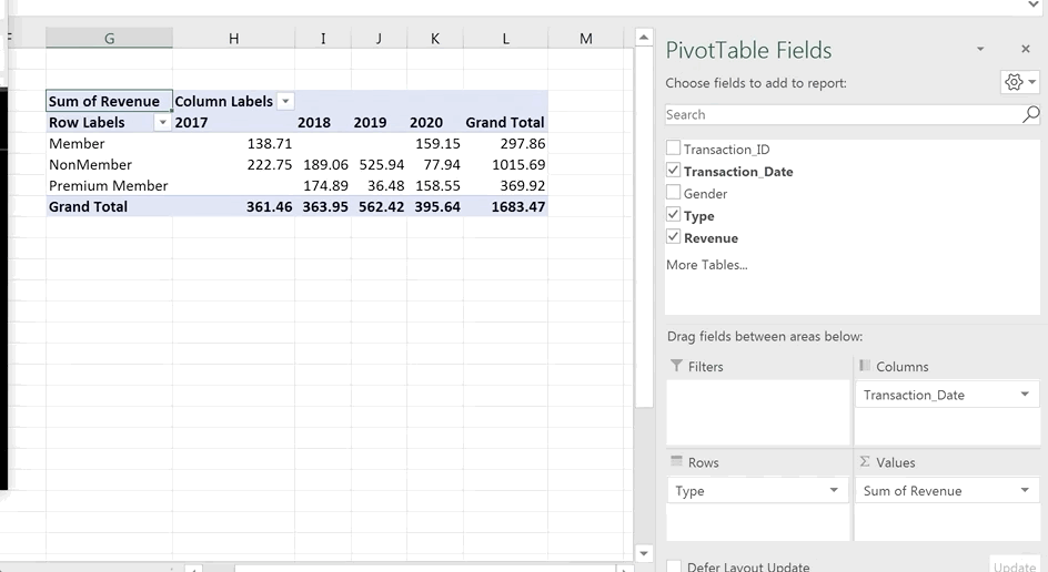
6. Choose where to place the PivotTable report. By default, the report will be placed in a new worksheet. For illustration purposes, the PivotTable report is placed in the existing worksheet on cell G3.
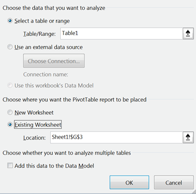
7. Select OK to create an empty PivotTable.
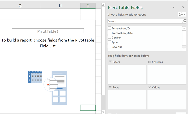
PivotTables are the visualization of the interactions of the different fields of the dataset, which are managed by the PivotTable Fields Pane.
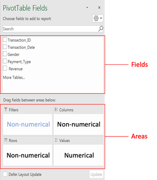
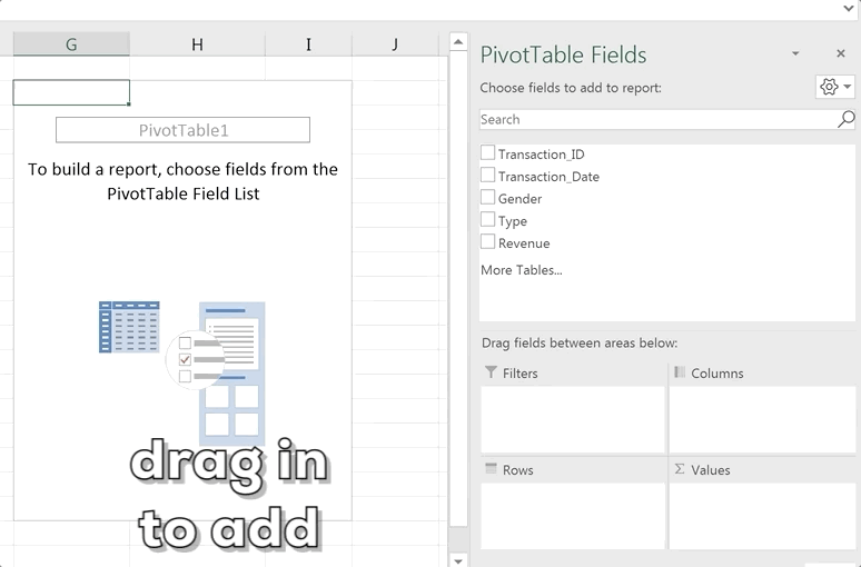
To add a field to the PivotTable, drag the field names to the four areas:
Rows / Columns: For non-numerical data (e.g., transaction date, gender, payment type)
Values: For numerical data (e.g., Revenue)
Filters: For non-numerical data (e.g., filtering out a particular gender or payment type)
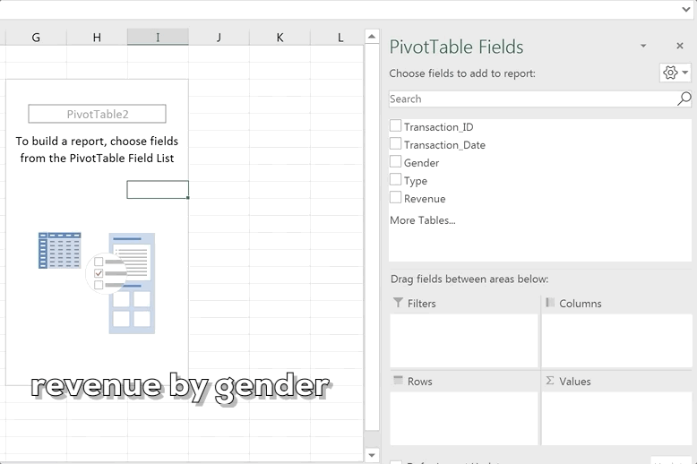
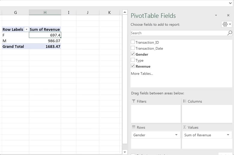
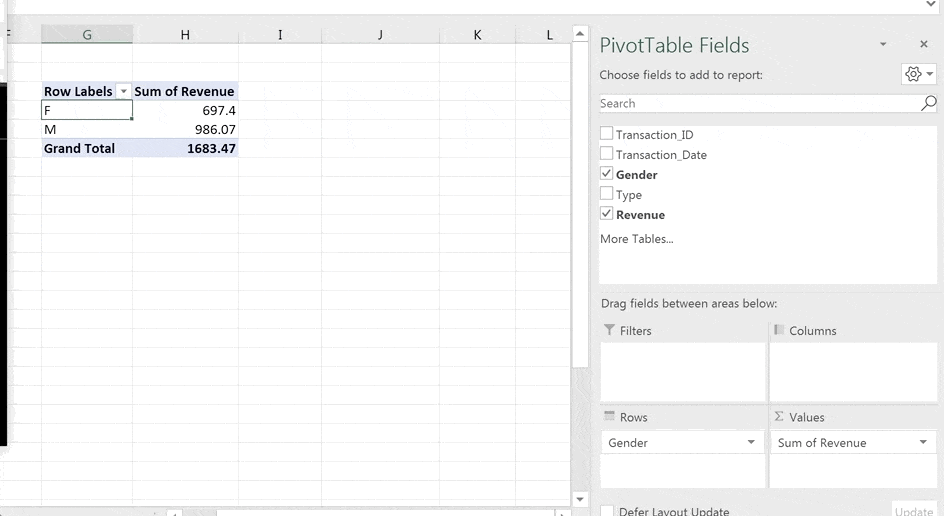
1. Drag the Revenue field to the Values area.
The PivotTable automatically displays the sum of the Revenue field.
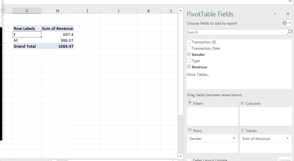
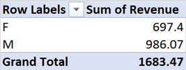
2. Drag the Gender field to the Rows area.
The PivotTable now segregates the revenue by the gender of the customer, with the genders displayed in the rows.
The PivotTable can also display genders in columns:
The above result shows that male customers spend more in total than female customers.
[For illustration purposes, all the examples in this blog primarily display the attributes in rows.]
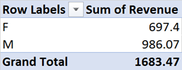
3. Besides the sum of the revenue, we can change how the data is summarized.
To do so,
a) Select any cell in the Values column of the PivotTable.
b) Right click and select Summarize Values By to call the list of functions for data summary.

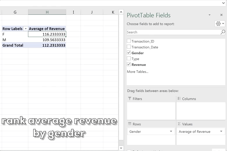
For example, select the count function to segregate the number of transactions by gender, or select the average function to segregate the average revenue by gender.
The above result shows that, despite a greater number of transactions by male customers, which may account for the higher total revenue, female customers on average spend more.
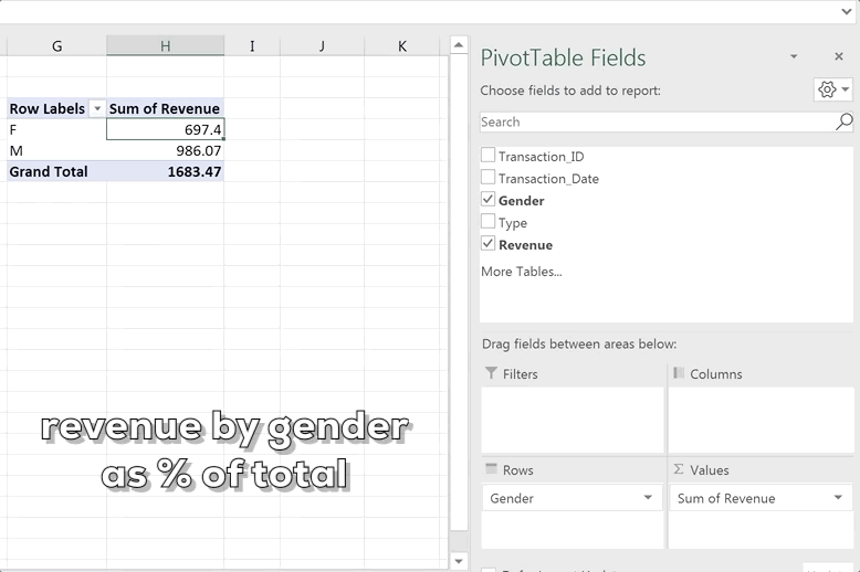
4. In addition to the summary statistics, we can also change how to display the data.
To do so,
a) Select any cell in the Values column of the PivotTable.
b) Right click and select “Show Values As” to call out the list of ways to display the data.
For example, use the “% of Grand Total” to display the sum of revenues by gender as percentages of the total revenues.
Or use the “Rank Largest to Smallest…” to display the average of revenues by gender as rankings (the gender with the largest average revenue is ranked as 1).
Changing the Attributes to Be Analyzed
To change the fields in the Rows/Columns areas, do the following steps:
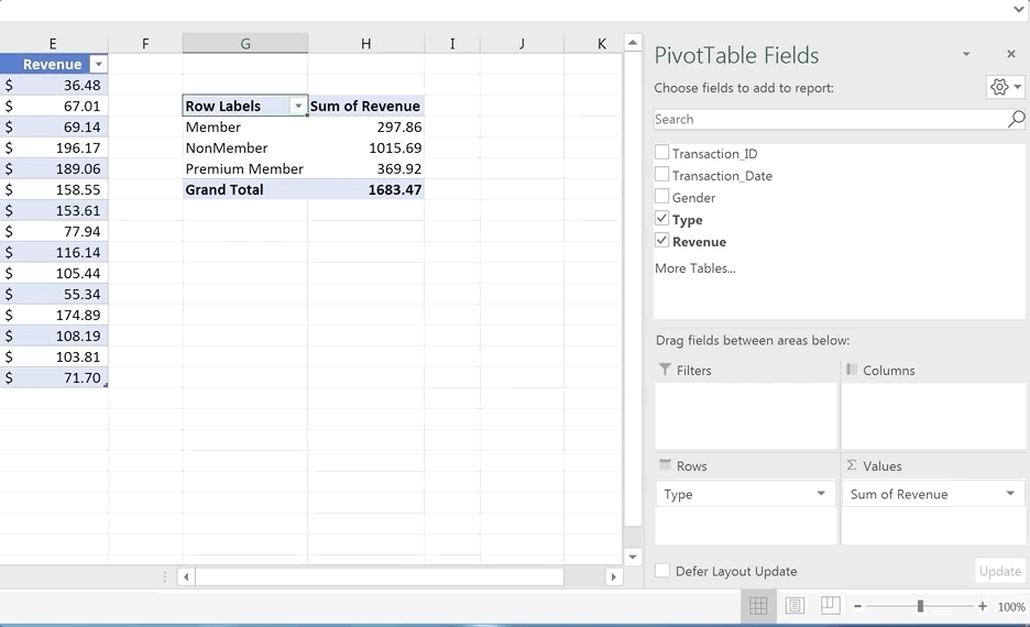
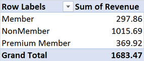
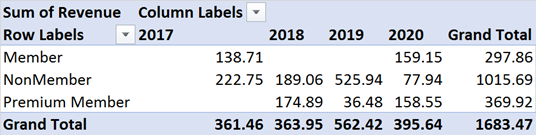
For example, instead of analyzing the total revenue by gender, we are interested in the total revenue by customer type. Drag the Gender field out of the Rows area and then drag in the Type field.

PivotTables are embedded with an Excel Auto Filter for filtering and basic sorting.
Consider the following PivotTable:
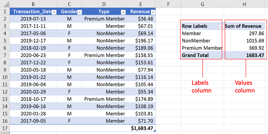
The Labels column displays the attributes and the Values column displays the results.
To filter the Labels column, open the Auto Filter. The attributes displayed in the Labels column can be selected by checking the boxes (e.g., “Premium Member”). Depending on the type of data in the Labels column, text filters, value filters, and date filters can also be used. Because the Labels column now contains only text data, the Label Filters acts as a text filter.
If the Label Column contains datetime data (e.g., Transactions_Date), the Label Filters now act as a date filter and can be used to extract results falling within a certain time period.
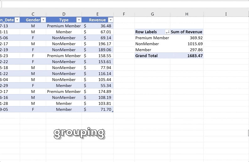
Results in PivotTables can be presented as grouped (clustered) data.
Assume the following PivotTable:
To group the customers as either member or nonmember (i.e., grouping “Member” and “Premium Member” together), do the following steps:
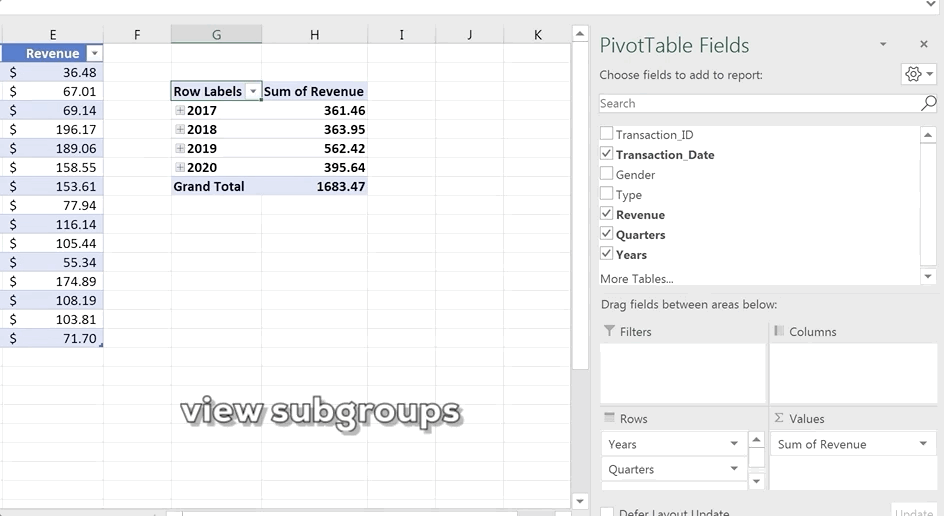
If the Labels column contains only datetime data, the datetime data are automatically grouped by years, quarters, months, and then days, forming a hierarchy of groups.
To view the subgroups, click the plus button to expand the groups. For example, expanding the groups for Years shows the subgroups for Quarters; expanding the subgroups for Quarters shows the subgroups for Months.
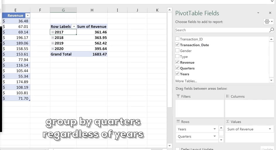
You can select your own custom grouping based on your needs.
Example: If, instead of the default hierarchy, we are interested in the results for every quarter regardless of the years, follow these steps:
Displaying total revenues by gender or by customer type are examples of a one-dimensional PivotTable. More dimensions can be added by using the following:
Consider the following PivotTable:

If we would like to explore the revenue from different genders and different customers, we can drag the Type field to the Columns area. Excel will now display a PivotTable with Gender as the rows and Type as the columns.
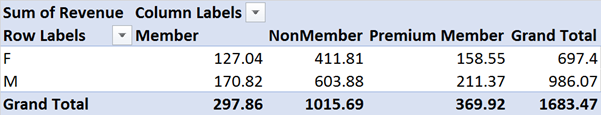
From the above result, we can see that Nonmember customers in both genders contribute the most revenue. Also, for all the three types of customers, male customers spend more than female customers.
Consider the following PivotTable:
To explore the revenue from different genders and different customers, drag the Type field to the second level of the Rows area. Excel will now display a PivotTable with Gender as the first level of rows and Type as the second level of rows. This leaves the Columns area for other dimensions such as the Transaction_Date field.
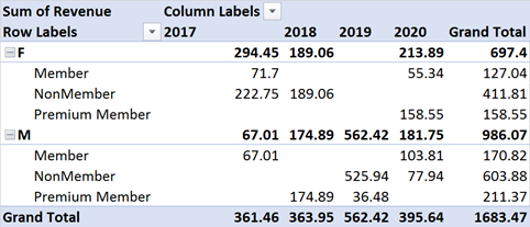
From the above results, we can see that all the revenue in 2019 was contributed by male nonmembers and premium members.
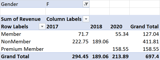
The filters area is similar to an Auto Filter in that it filters the data and shows only the results for a particular aspect.
Consider the following PivotTable:
Dragging the Gender field into the Filters area creates a filter above the PivotTable.
By selecting a single attribute (e.g., Female), the PivotTable shows only the results for that attribute.
If we are interested in filtering out multiple aspects, check the box for Select Multiple Items and select the aspects in the filter above the PivotTable.
At Gleim, we know learning data analytics is vital for future accounting professionals. That is why we are offering this series of data analytics blogs and continually updating all of our review materials for CPA, CMA, and CIA with the necessary information you need to pass your exams!
We’ll continue our weekly blog series. Check back regularly for all exam news and study tips!
Python Lessons
Python Basics
Conditional Statements
Loops
Functions and Modules
Numerical Python (NumPy)
Pandas Basics
Pandas Data Capture and Cleansing
Merging and Grouping
Manipulating Text and Datetime Data
Visualization
Web Scraping
Errors and Exceptions